


Availability
Next available slot - 1 Aug.
Secure the spot.
New Case
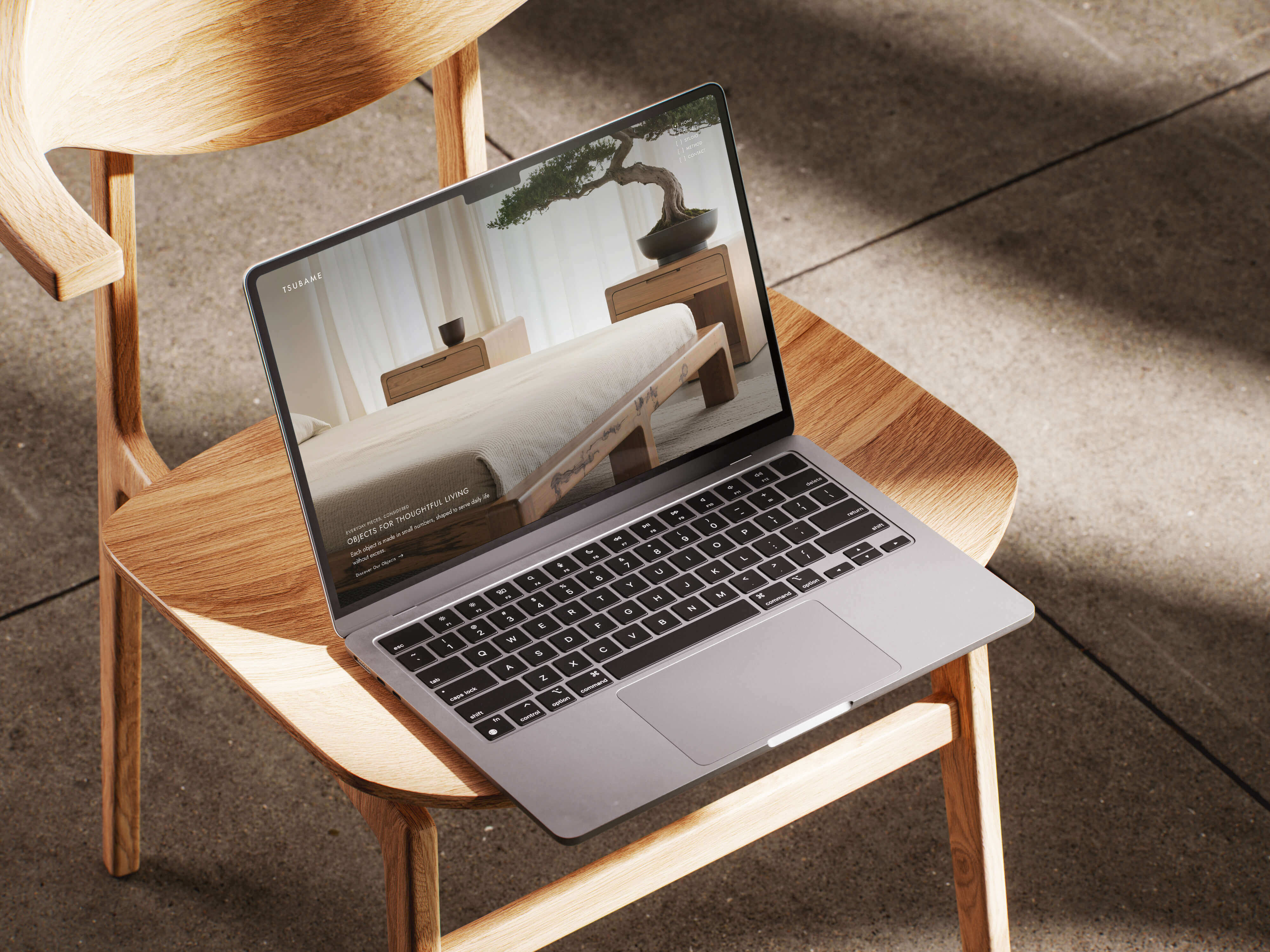
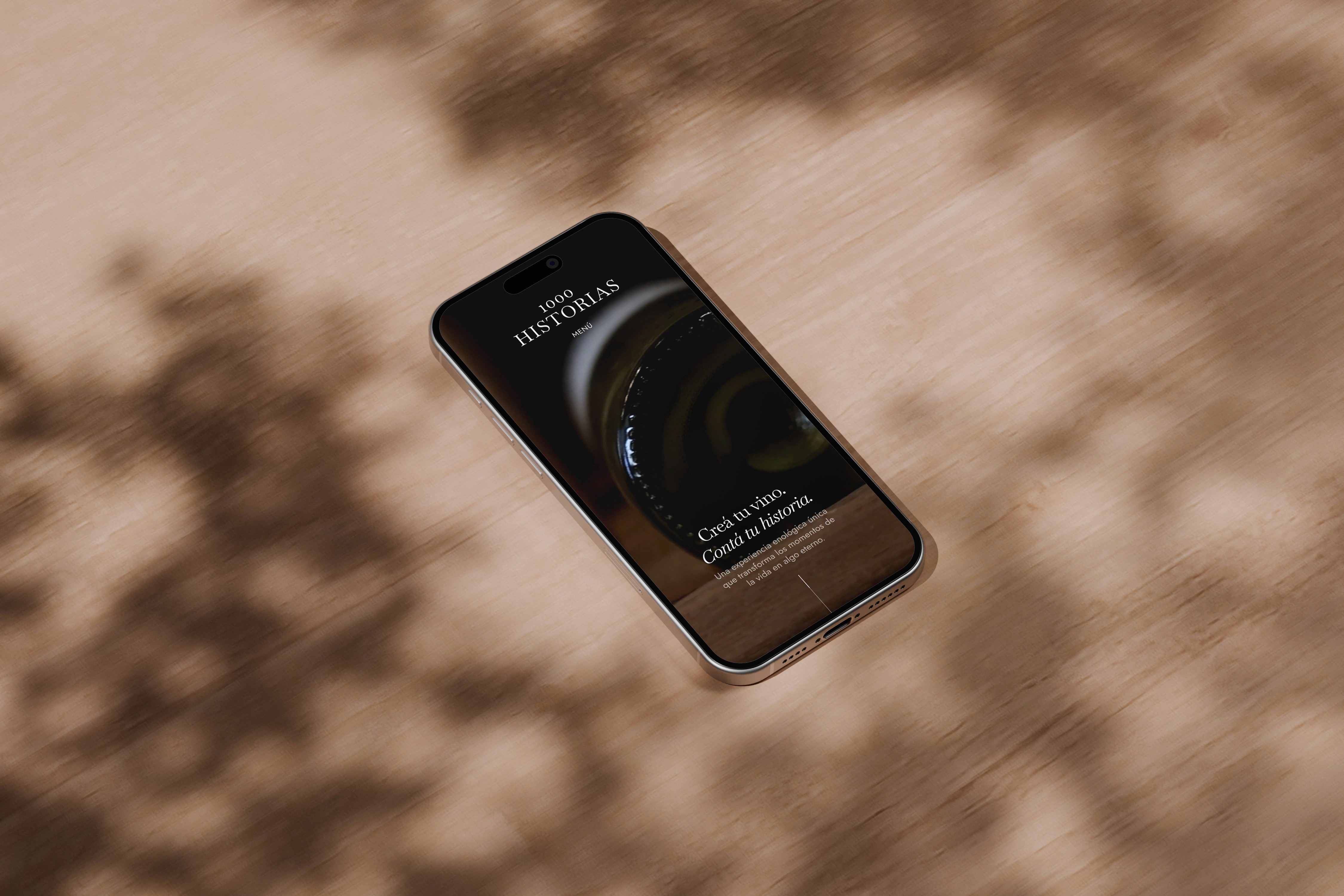
A collaboration with a Copenhagen-based translation company, i-taalveien, is now live.

Guarantee
Revisions until you’re satisfied. Satisfaction guarantee active until February 16.
Availability
Next available slot - 1 Aug.
Secure the spot.
New Case
A collaboration with a Copenhagen-based translation company, i-taalveien, is now live.
Guarantee
Revisions until you’re satisfied. Satisfaction guarantee active until February 16.